Brand Guidelines
The visual DNA, voice, and vocabulary of Klipr. Click any swatch to copy its hex.
Linkable anchors on every section (/brand#colors).
Overview
Klipr is the share-first capture tool for the URL era, built on storage you control. One hotkey, one URL — klips live in your Drive, your S3 bucket, or your on-prem store.
Teams who've hit the ceiling on their current capture tool — price, platform, file ownership, or compliance. Loom-exhausted async teams who want their klips to stop living on someone else's cloud. Regulated enterprises (banks, healthcare, legal, gov) who structurally can't use Loom and need BYOK, SSO, audit logs, and on-prem deployment. The brand is direct, tool-like, and respectful of expertise — it speaks to people who don't need hand-holding.
Logo
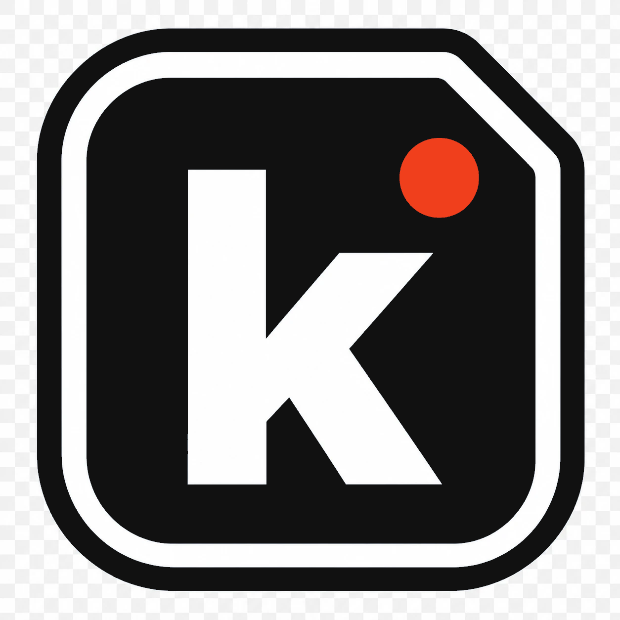
The official Klipr logo pack. Use the icon as the standalone app mark, the wordmark for branded headers, and the glyph only when another UI element already provides the container, such as a circular avatar or badge.
Dark mark on light backgrounds. Use when the canvas is white, cream, or a light tint.
Light mark on dark backgrounds. Use on Ink, Panel, or any dark / saturated brand surface.

Dark transparent glyph with the rust dot for circular avatars, badges, and other containers on light surfaces. Do not use as the standalone app icon.

Light transparent glyph with the rust dot for circular avatars, badges, and other containers on neutral dark surfaces. Do not use on rust.

Single-color dark glyph for rust, amber, and other saturated light containers where the rust dot would not read.

Single-color light glyph for rust, amber, and other saturated dark containers where the rust dot would not read.

Logotype lockup for light backgrounds. Default choice on the marketing site light theme.


Maintain clear space equal to half the mark width on all sides of the icon, or the cap-height of the wordmark for the lockup.
Mark alone: 24px (digital), 8mm (print).
Glyph in a container: 16px (digital).
Wordmark lockup: 80px wide (digital).
Tagline
The tagline appears across all surfaces — meta tags, app store descriptions, hero banners, and email footers.
Colors
A warm, editorial palette anchored in rust and ink. Dark-first, with a cream Paper for light contexts. Click any swatch to copy its hex.
All text-on-background pairings must meet WCAG AA: 4.5:1 for body text, 3:1 for large text.
Never rely on color alone — always pair with shape, label, or icon.
Iconography
One custom family. 31 icons, 24×24 viewBox, 2.4px stroke, rounded caps. Glyphs render in currentColor so they inherit the surrounding text color; the terracotta (#F03F1C) accent is opt-in via variant="highlight". Click a tile to copy its <Icon name="…" /> usage.
Every klip has a type. The icon uses the surrounding ink/paper color like any other icon — the type color appears on the chip background, the thumbnail badge, and the 3px left-border on list rows. Color is never the only signal; the glyph is always present. Click a swatch to copy its hex.
<Icon name="…" /> from @klipr/ui. The full typed roster is exported as IconName.color. Don't hardcode fill or stroke on the <svg>.var(--accent).packages/ui/src/components/Icon.tsx in the family style.Typography
Three typefaces, one job each. All available free on Google Fonts.
@import url('https://fonts.googleapis.com/css2?family=Inter:wght@400;500;600;700&family=JetBrains+Mono:wght@400;500&family=Space+Grotesk:wght@500;700&display=optional');
Voice
Direct, not brusque. Tool-like, not clinical. Klipr talks like a sharp colleague, not a corporate product.
"The capture tool built for an AI world."
"Button: 'Capture Region' — not 'Start Screenshot'"
"Couldn't connect to Drive. Check your connection."
"Klip saved to your Drive."
Vocabulary
Locked terms for product copy, docs, and marketing. Consistency here shapes how users understand the product.
Layout
Spacing scale, border radii, and grid rules. Built on a 4px base unit.
--space-14pxTight internal padding--space-28pxBetween related elements--space-312pxCard internal padding--space-416pxBetween cards--space-624pxSection gaps--space-832pxMajor section breaks--space-1248pxPage section separation--space-1664pxHero / header spacing6px10px14px9999px50%
Max-width 800px for narrative content,
1100px for full-width brand surfaces.
Desktop gutter: 24px. Mobile gutter: 16px.
Motion
Snappy but not frantic. Klipr is a tool — motion confirms state, it doesn't perform. Always respect prefers-reduced-motion.
@media (prefers-reduced-motion: reduce), all transitions collapse to 0ms.The active-recording indicator uses a slow, breathing pulse: scale(1) → scale(1.12) → scale(1) over 1.8s with ease-in-out. This is the only looping animation in the product — reserve it exclusively for live recording state.
In Practice
How the brand system comes together across product and marketing surfaces.
Mark on Ink, no border. 400×400px minimum.
Brand gradient + Space Grotesk tagline on Ink.
Klip preview inside an Ink-background card frame.